Good content is critical for a writer but how that content is presented is also important. In Brand Basics – 2 Considerations For Writers, we discussed the importance of consistency across your social media networks. Using the same images and verbiage will tie together your unique look and help people recognize you. As you develop that look, choose colors and fonts that enhance your brand and help you stand out.
Colors
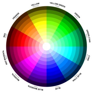
Response to color varies from person to person, and even between males and females. Most research proves, however, colors convey these basic feelings:
- Red – fire, stimulating, but also anger
- Orange – fire, adventure, optimism
- Yellow – sun, happiness, energy
- Green – nature, peaceful, but also envy
- Blue – waters, trustworthy, masculine (favorite color of men)
- Purple – royalty, sophisticated and artsy, but also feminine
- Brown – earthy, rugged, but also dirty
- Black – classic, strong, but also grief
- White – purity
Lighter shades have a more feminine quality, while stronger hues feel more masculine. The colors you choose should resonate with your audience, enhance your look and also complement your voice.
Choose 2-3 colors to use consistently on your website, and use those colors as often as possible in your shareable images and infographics. Your readers will begin to associate those colors with you and your work.
Fonts
With so many free Google webfonts, we’re no longer limited to a handful of options on our websites. Sites like Font Squirrel and DaFont also provide access to many free or affordable options to use with our logos and our graphic design projects.

When selecting fonts, consider the overall look and feel you want to convey. Consider pairing two different but complementary fonts, using a standout font for headers and a simpler font for body text. Use the same (or similar) fonts on your website and in your shareable graphics and images.
Research
Pay close attention to your favorite authors and influencers and notice how they incorporate fonts and colors in their brands. One of my favorites is Amy Porterfield. She repeats the bold colors from her header in her featured images and infographics. The backgrounds are solid colors and she uses two basic fonts: a handwritten font for standout text and a sans-serif font for her body text.
If you pay close attention, you’ll see the “How to” text on the top line differs slightly from text on the bottom line. The fonts are actually the same family, the top font is the narrow version.
Fiverr offers graphic designs starting at $5 (hence the name). Although very few of them actually deliver a product for that price, it’s a good place to find samples. Look at the portfolios for some of the top designers and see how they use not only colors and fonts, but also images, graphics and white space. What looks are pleasing to your eye?
Last Word
Remember when choosing fonts and colors: LESS IS MORE. Over 50% of your readers will view from a mobile device (cell phone or tablet), so choose fonts and colors that are easy to read on a variety of devices. Create a look that’s recognizable to your readers and then incorporate those elements as you share your great content.
Tweetables:
[bctt tweet=”Create a look that will represent your #writer brand, via @a3forme @susanrstilwell #amwriting” via=”no”]
[bctt tweet=”How colors and fonts can enhance a #writer brand, via @a3forme @susanrstilwell #amwriting” via=”no”]

Resources:
FontSquirrel and DaFont
how to add to Google web fonts to blogger
WordPress plugin to add Google web fonts: easy google fonts
Additional Reading:
The Psychology of Color in Marketing and Branding
Photo Credits
Color Wheel: Sailom, FreeDigitalPhotos.net
Amy Porterfield, screenshot


2 Comments
Great timing, Susan! This is an excellent post for those of us trying to spiff up our blogs (or start a new one!). I plan to spend time perusing the Fiverr site this afternoon. Thank you!
Glad you enjoyed it, Cathy. There’s always something to massage on our sites. It keeps things interesting!