Are you pleased with your website’s Home page? The way it looks, its design, and most important, its effectiveness? If not, read on!
Beneath your Menu bar (sometimes called the Navigation bar–it’s at the top of your web page) is your most important real estate anywhere online. It’s referred to as the area, “above the fold,” or “above the scroll,” meaning the part of your Home page readers can see without having to scroll further down the page to see it all.
More visitors will see this area than any other on your website. Ever. It has a vital job: to get your visitor’s attention and inspire them to sign up for your free resource (called a Lead Magnet in marketing speak).
Within this “above the fold” area, the most effective websites include two columns. They’re not visually separated into columns, but you want each column’s contents to take up approximately the same amount of width and height.
Include the following elements in either the right or left column areas:
A great, color photo of YOU that takes up that area of the page “above the fold,” along with your name and title (Author, Public Relation Expert, whatever’s applicable). That should fill the entire “above the scroll” space but not spill out from it.
In the second, opposite column, include four short areas of text and an opt-in button:
#1: a short description of your audience (my audience is Christian writers and speakers).
#2: your main headline for this area addressing the frustration or goal your audience seeks to change, OR a strong statement that will resonate with your audience.
#3: a single line of text shaped in the form of a promise or a result.
#4: two short paragraphs–only 1-2 sentences each–identifying the frustration or goal you know your audience is seeking to change.
Plus:
– an opt-in box that includes two small text boxes, one each for your reader’s first name and email address, and
– your CTA (call-to-action) button for readers to click or press after they’ve “signed up” for your free resource (added their name and email to receive it).
You’ve seen 100’s or 1,000’s of these opt-in boxes through your many years online.
It’s very important that the text on your call-to-action button is not the word, “SUBMIT.” No one wants to submit. To anything. Particularly not to a total stranger.
The Website Police aren’t going to drag you out of your home at 3AM if you use SUBMIT, but since we know readers find it offensive, why use it?
There are so many other, non-offensive options! In fact, text that’s related to your giveaway (called a Lead Magnet) is much wiser.
Say you’re giving away a checklist of various sizes and uses of skillets for gourmet cooks. Your CTB button text could be, “I need to use the right skillet!” Or if it fits your personality, consider, “Gimme the checklist!” or, “Checklist, please!”
You could also use a phrase as simple and direct as, “Sign me up!” or “I need this info!” Use whatever seems best to you.
Note that your website theme may have a limit on how many characters (letters) your CTA button allows. So, if you have a fun phrase but it has too many letters, simply experiment until you find a shorter version and you’re all set!
Studies show that filling your Home page’s area “above the fold” with an offer your audience considers a “must have” will spur growth.
Fill the balance of your Home page with pertinent content that seems right to you.
The options are limitless. Research competitors and near-competitors for fresh inspiration. No need to copy anyone. Christ is creative enough to give each of us a unique viewpoint for the message He’s gifted us to serve.
But keep your Home page’s area “above the fold” exclusive, using it only to showcase your current free resource (Lead Magnet).
Try it! You’ll like it! So goes the Alka-Seltzer marketing phrase from the early 70’s. 🙂
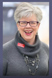
Patricia Durgin is an Online Marketing Coach and Facebook Live Expert. She trains Christian writers and speakers exclusively, helping them develop their messaging, marketing funnels, conversational emails, and Facebook Live programs. Patricia hosted 505 (60-minute) Facebook Live programs from 2018-2020. That program is on indefinite hiatus. She’s also a regular faculty member at Christian writers and speakers conferences around the country.
Website: marketersonamission.com
Facebook: MarketersOnAMission


No Comments